

After migrating our servers to ā’pěks 18.1, we kept our normal development cycle. We apply Scrum to all our projects, allowing us to perform an Agile development strategy. We always keep adding some new features from our Product Backlog to our apps in a continuous mode. One of our products is a Service CRM system, designed for companies offering services as products. This sCRM, whose main characteristics can be found at products and services page, includes a module or app for end customers. There, they make themselves a clear picture of the services requested, outstanding charges, the person in charge or completeness of the activity itself, etc. without needing to disrupt the normal workflow of the staff. So our first focus was on improving our mobile interface for the next release.
we had to go mobile
Once you have a general overview of the business idea behind this app, I’m sure we all will agree that a better approach for its design would be going for a mobile interface. The market trends show nice and clear how the mobile interfaces are getting more popular day by day. And if we join that to what we can accomplish using Universal Theme, then it’s easy to understand where we are going with this solution.
Until ā’pěks 18.1, Oracle used jQuery Mobile to create mobile-friendly UI. But, to be honest, this interface type wasn’t really user-friendly for modern apps. In their release notes for Oracle ā’pěks 18.1, they added this release note:
7.1.11 Desupport of Mobile Theme – 51 and the jQuery Mobile User Interface
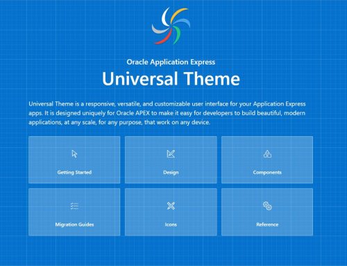
The jQuery Mobile user interface and Mobile Theme – 51 are desupported. The last stable version of the jQuery Mobile open source library was released on 10/31/2014 and only provides support for jQuery versions 1.8 – 1.11 and 2.1, which no longer receive patches. Oracle Application Express release 18.1 ships with jQuery 3.2. All new application development targeted at mobile devices must be done using the responsive Universal Theme. jQuery Mobile will no longer be supported in future releases.To learn more about migrating existing applications to the Universal Theme, go to the Universal Theme application at https://apex.oracle.com/ut and select Migration Guide.
But far from being a problem, this notice is a positive turning point for us. Now, Oracle is more focused on creating a richer UI, which is mobile first for the Universal Theme. They’re adopting design patterns that allow us, developers, to create a single interface, very capable of being used on a mobile device or on a traditional big screen with some easy tricks.
about the old Clients Portal
Taking into account the great effort of the Oracle’s APEX team to improve the mobile “friendly-ness” of our apps, we decided to give it a try after migrating to ā’pěks 18.1. The main sCRM app is a pretty standard corporate CRM. There’s a lot of information to display at the same time, so we developed this app with a normal size screen in mind. However, for this Client Portal, there’s less information to display. Before, we used a responsive approach, displaying most of the information on one page. You can see an example of how our app looked at ā’pěks 5.0 – 5.1 (you can click on the screenshots to enlarge them).

When customers accessed the old app using a mobile device, everything worked fine, but things didn’t really feel natural. We followed a design pattern mainly though for big screens, and that was something you could notice, especially on badges and reports.

The app was functional. That was exactly what our customers wanted. The services industry is not really into the IT world and design trends and our customers just needed a good way of interacting with their clients, to provide some feedback on their work and exchange documents/information. As they normally use the Core App on a desktop, they thought this approach was a perfect solution for this project. Once the product was in production, we had time to organize a bit better their requirements while thinking a bit more about the end users of this app.
Universal Theme in ā’pěks 18.1
With this latest ā’pěks release, we had the opportunity to change a few things for this app. For example, we moved from the navigation we use to have in the left column to a top navigation bar. “Top Navigation Tabs” is a responsive element that changes its position depending on the screen resolution. These tabs are at the top of the window for normal screens, but for mobile devices they stick to the bottom, creating a richer experience on those devices.

To use this type of navigation, we had to revert from the customer’s main requirement. The goal of this app was displaying most of the relevant information for the end customer in one page. That would reduce the number of clicks, and customers would feel comfortable on checking all his or her relevant information. However, we can’t follow this idea for a mobile interface. In most cases, you needed to scroll a lot to review some information as you saw before. That’s why we moved to this type of navigation.
responsiveness
Once we changed the old navigation approach, we also modified some reports. Before we only provided the “Open Activities” report requested by the clients. Now, we display both open and closed activities. And talking about reports, we’re using the new Reflow Report in this case. This new region type collapses into an easier-to-read display when using a small screen. However, this region type still has some style issues: columns alignment and handling the overflow of text. Even more, there is some type of restrictions in the current version. For example, you can’t display a column based on a LOV (list of values), download a blob file and a few others.

The transactions section now includes a detailed view of all the Funds and Charges movements, using this new Reflow Report. We have also improved the attachments section, including a nice search bar that uses a dynamic action to perform our search. Now, our customer’s clients can access most of the relevant information for them, at any time they need and by using any type of device they want while having a better user experience. Our customers keep working the same way while saving time and resources, and their clients are very happy with the great service provided.
our conclusions
Since we released this new sCRM’s Client Portal version, the end users are using this app much more than before. According to our statistics, this trend continues, pointing out that we made the right changes and choices. Nowadays, it’s very important to take care of the design of our apps. For sure, functionality drives the process, but the user interface is critical too. Oracle ā’pěks provides, out of the box, great capabilities to make our apps mobile friendly. However, it’s important to follow some basic guidelines to ensure you accomplish the most usable standards. Just by choosing the right elements, our ā’pěks apps will be prepared for the upcoming customers’ requirements and a bright future.
If you are interested in more details about our sCRM solution, please visit the product page by clicking here!

Leave A Comment