

This post is related to our previous blog post – A new mobile interface for sCRM Client Portal, where we talked about turning our application’s interfaces more mobile friendly. To contextualize a bit, we have an Oracle ā’pěks dedicated team working on some of our products. For one of those products, we wanted to improve the user experience when using small screens without using many custom elements. Here we want to give you some guidelines we followed to get there, just based on our experience and preferences.
navigation menu vs. tabs
The way how we interact with our apps is really important. To provide a good user experience, using the app must feel natural. If we want to have an app mostly used on mobile devices, is better to follow the most popular extended patterns. This, both in Android and iOS means a navigation bar attached to the bottom of our screens. Four to five tabs are ok, but if you need more elements you might need to use the burger menu. The great thing about the Navigation Tabs is that is a responsive element. When visiting the app using a bigger screen, the display changes to a Top Menu Bar out of the box. If we can afford the limited number of tabs for our app, this element is a great “mobile-friendly” option.


improve the UX keeping things simple
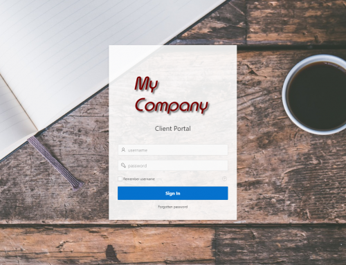
For a small screen, we must have one objective: We cannot saturate the screen. That will lead to a miss-use of the app. Having elements easy to reach, big enough to use them without any issue, is mandatory. For example, we’re not using the search field of the Interactive Report at Customer Portal (LINK) because of its size. Instead of that, we created a “search bar” using a text field. To behave properly, we use a Dynamic Action to perform a live search while typing. Using this approach, we created a nicer element, by using the new float item template. This doesn’t mean that a built-in search bar is a bad approach. However, this element improves
Another approach we used to avoid saturation was splitting the user’s profile page. We use a view to join a few tables and select all the needed fields for this entity. However, at the front-end, we don’t need to display them all on a long page or form. We split those elements into subregions, accessible using descriptive tabs at the top of the page. Using this approach, we reduce the elements displayed on the screen at the same time, while this intuitive navigation makes elements easy to find. We should not simply visualise our database structure in our front-end, as that might not be very user-friendly.

special care with forms
Normally, our Oracle ā’pěks apps include forms. It’s the perfect way to add or update information. However, long forms with many fields to complete are not a very user-friendly approach when talking about small screens. That’s why it’s important to pay special attention when we incorporate these elements. To make forms usable by users we need to pay attention to the little details:
- Follow a natural order when displaying the input fields. It’s very frustrating jumping between columns, so try to be sequential using a natural scrolling pattern. Using Universal Theme, we have a great part of the work done, as forms normally collapse to 1 single column when using small screens. However, we need to pay attention to the order we display items on our desktop design to collapse correctly on mobile interfaces.
- If your selection list includes less than 5 elements, make it a pill button set. Now, we can even have this buttons displayed in several lines if needed, creating a grid of elements. Help your users to fill the information faster using this approach.
- Buttons. Of course, we need this element to perform some actions in our pages. To be also helpful, it’s important to allocate them in a natural position at the page. If you have a form, the submit button must be at the end of it. So run away from fancy designs with buttons at weird locations and display them where they belong. Going a bit further about buttons, size and colour matter. Sorry for saying that, but we need to think about our users and make buttons easy to find and easy to use. Accessibility is very important.

always provide some feedback to the users
Very often we develop in local machines or using a high-speed connection to our cloud workspaces. Even noticing that mobile networks are becoming faster and faster, it’s important to keep low connectivity in mind. This should be contemplated at any kind of web app, but especially for mobile interfaces, we recommend Dynamic Actions over Page Submissions. If we include something like a date range picker for a chart or report, it’s better to only refresh the affected region using a DA instead of submitting the entire page. That reduces a lot the network traffic but also includes a built-in spinner to warn the user about the work in progress.
Going a bit further on this idea, you can also search a bit about lazy loading and try to implement this pattern into your projects. Living in the internet era is not an excuse for not optimizing our resources as much as possible, and reducing our apps’ traffic is something very important. However, if we need to perform heavy traffic tasks, users need to know that something is happening. Avoid sending a very heavy query to the server several times worths the effort of adding some feedback.

HTML, CSS and JavaScript
Oracle ā’pěks is a low code framework where we can easily create web apps in a really easy way. However, we shouldn’t lose the focus on what’s behind and that’s HTML, CSS and JavaScript. When using the Universal Theme, we just need to visit the Universal Theme documentation to check most of the resources available out of the box. Very easily, we can have an app up and running in no time by using the declaratively defined elements. At the referred website, you can also find some other guidelines, design patterns or code snippets that might be useful when it comes to enriching or designing a mobile interface.
However, is very easy to use our web knowledge about those languages to extend our apps when needed. We can discuss this point to evaluate the benefits of using elements that might need future maintenance, but we’ll leave that for a meetup session! Few lines of CSS can add great value to a report, to a login page, etc. There’re also easy ways for showing or hiding regions or items depending on the screen size and only using certain classes.
But, as you can see, this is a topic that could lead to a meetup or a conference session, so we’ll dig a bit more about this dilemma soon.

conclusions to go mobile
You just need to read a bit around, and you will realise the growing use of mobile device, for small screen rendering of web applications. It’s mandatory that we have that in mind when we develop new apps. However, don’t try to reinvent the wheel when it comes to small interfaces. Not all of our apps need to be designed for a mobile interface. But having some of these highlights in mind, we can end up with far better interfaces.
With Oracle ā’pěks, we can be very creative just by using the UT elements in a clever way. If we want to create a useful mobile interface, we should adapt our workflow and design the best practices in web development. If we research a bit about the top five to ten apps at any platform store, we’ll see the common factors in the way of accessing the user profile or performing the main functionalities of the app. We can use the same approaches that all those apps use, and our Oracle ā’pěks apps will increase their usage, and create even value on their own.


Leave A Comment